Neurotech 2024
Crafting a website as innovative as its subject.
Overview
NEUROTECH 2024 was a UC Davis-hosted Neurotechnology conference, with attendees from all across the UC system. The Davis Neurotechnology club, not having any designers of their own, reached out to me and asked if I could help design the website for this year’s conference. I worked with their own developer, and initially was also going to have another designer to round out the website after I created the visual identity and homepage—I would later learn he did not complete the work, so the rest of the website ended up being designed by the developer. I did my part of the work in approximately 2 weeks.
DURATION
2 weeks
ROLE
UX/UI Designer
TEAM
Lead Developer
Getting on the same wavelength
First, I had a few meetings with members of the club to collect information about what information and functionality the website needed to have, as well as to understand their preferences in terms of visual design. From here, they provided me with the link to their old website—which we agreed could be improved from a design standpoint—as well as links to websites they liked the style of. This inspiration would prove to be crucial in guiding my design decisions.
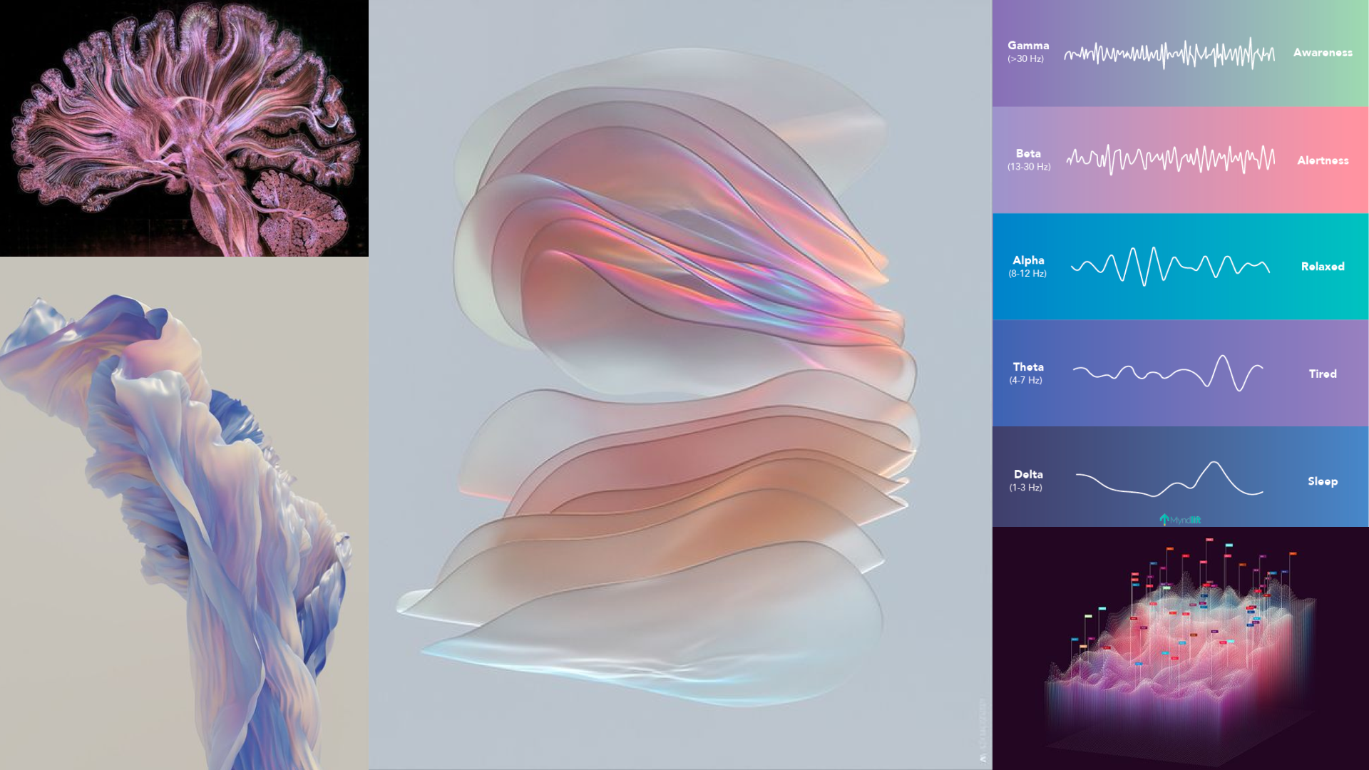
We also talked about a concept for the website. Many websites of similar organizations tended to take visual inspiration from either the brain or neural nets, so we agreed that trying to take a different approach would be beneficial. After looking over the conference info, I proposed the theme of “the new wave of neurotechnology,” focusing on the innovation within the field as well as making a sort of pun from the idea of brainwaves, and the Neurotech team agreed.
The Mind’s Eye
The Neurotech club’s main color is blue, so I wanted to incorporate that into the design in some way. However, like the brain/neural net motif, a blue and white color scheme was also extremely common in the field, and would have ended up forgettable or even boring. With a theme like “the new wave of neurotechnology,” I knew we needed something a little more novel. So, after playing around with different color palettes, I settled on a combination of blush pink, lilac, and Neurotech Blue. The pink subtly evokes the brain, while the blue is emblematic of their club and reminiscent of academics and technology. The lilac bridges the gap between the two, creating a cohesive overall color scheme.
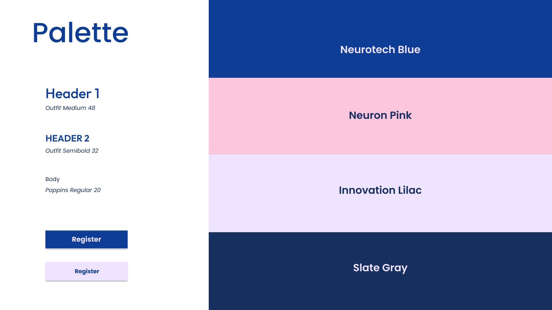
With enthusiastic approval of the colors, I worked with my developer teammate to explore fonts. While we experimented with a trendy monospace and display fonts, we ultimately ended up settling on a sleek sans serif, feeling that it connected best with the colors we had chosen.
Mapping the Neurons
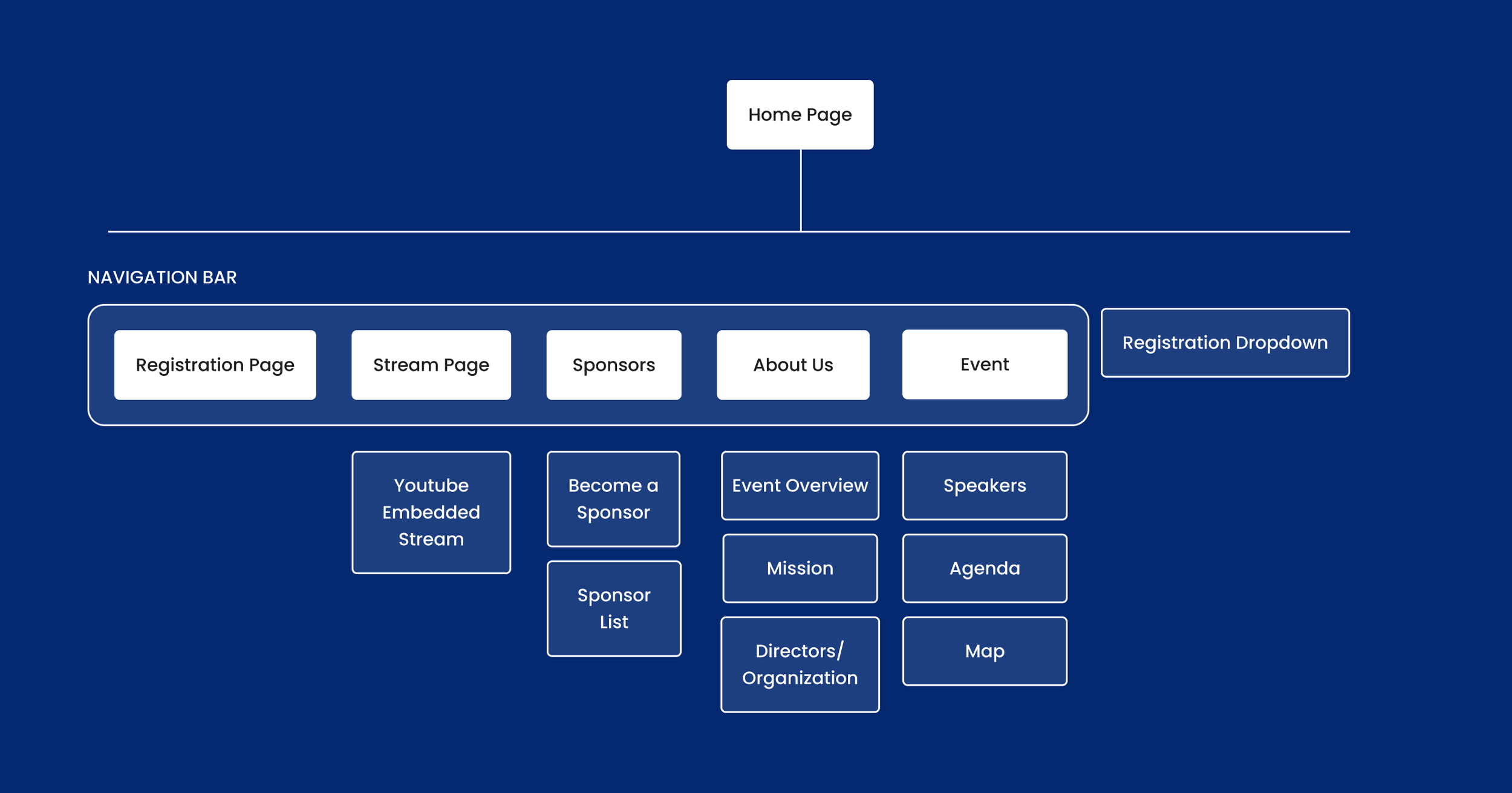
With this settled, I referred back to my discussions with the team, and got to work creating the information architecture for the site. I drew inspiration from the previous year’s website, while also making a few changes according to best practices and my intuition (given the short timespan and relative simplicity of the project, it would not have been efficient to conduct any rigorous user testing—I went with my gut). After some discussions with the team, I made a few tweaks and set to work with the low fidelity wireframes.
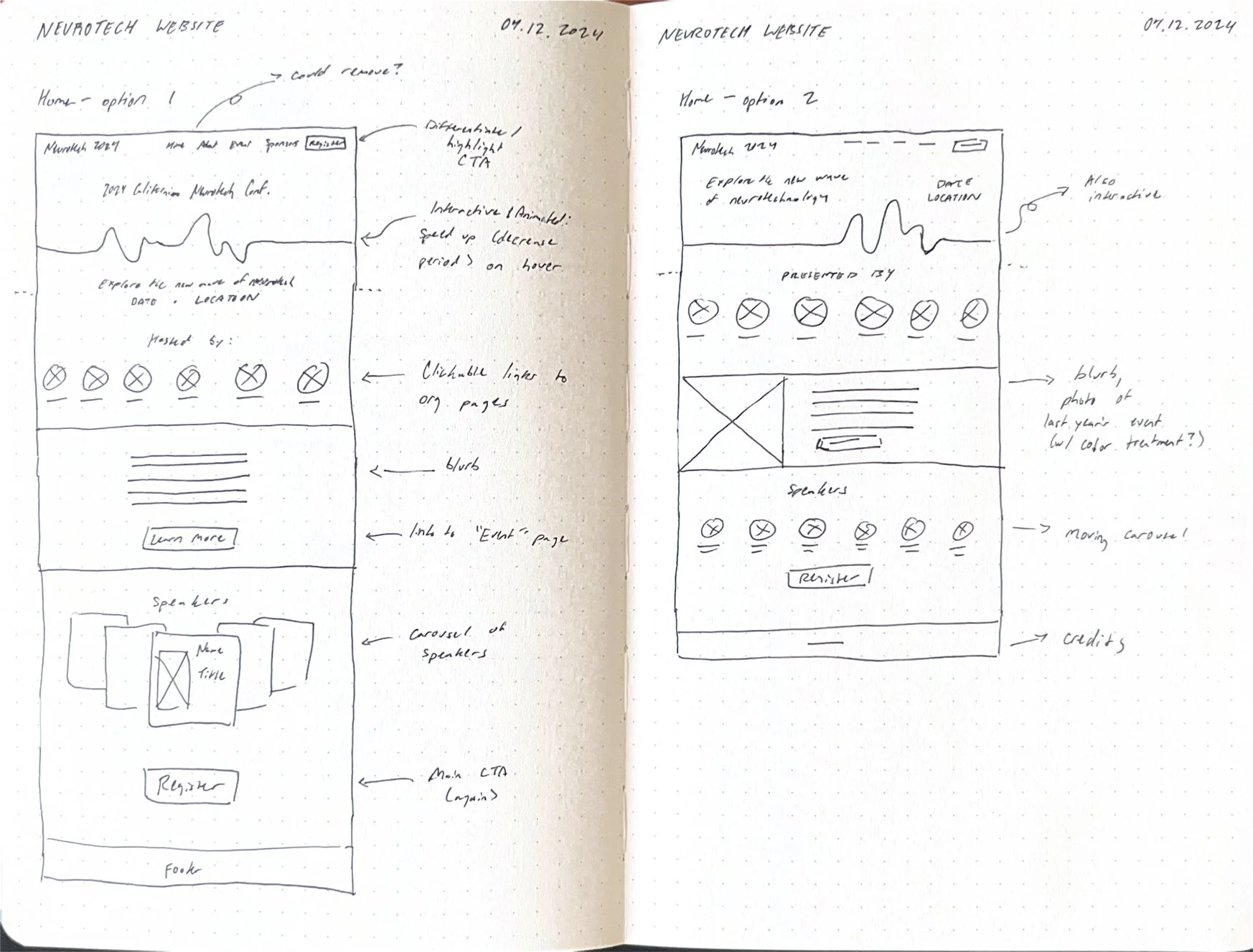
As I was only responsible for the homepage, I explored a few different layouts for information, while also considering the content of the other pages. This allowed me to weigh different options, before settling on the final layout for the high fidelity prototype.
Setting the Nodes
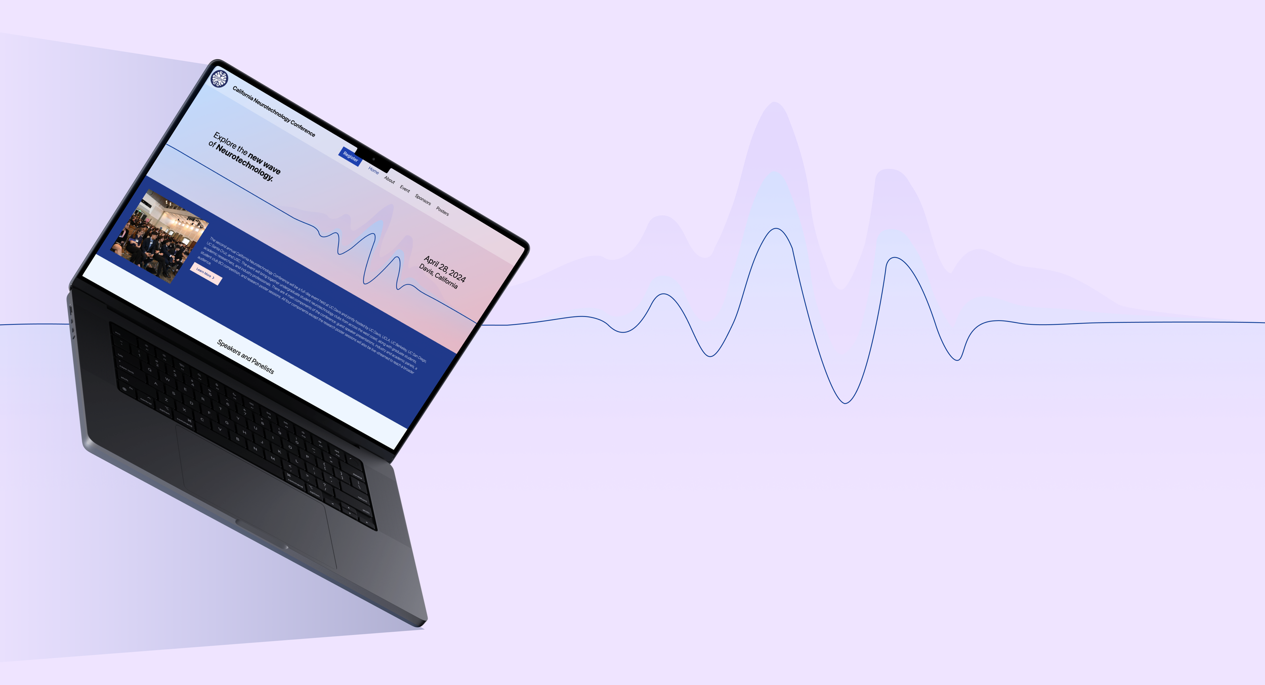
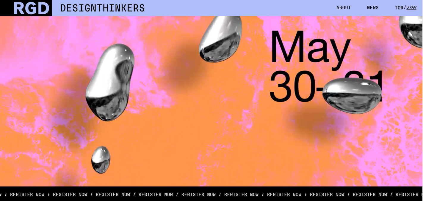
Bringing together the colors, theme, typography, and layout of previous steps, I proposed a high-fidelity prototype. The most notable feature of this was a “wavelength” pulsing as the hero image at the top of the homepage—upon hovering the mouse over it, the intensity of the wavelength would increase, adding a bit of interactivity.
After handing off the design, however, the interactive portion proved a bit unwieldy, so I was forced to adapt, offering an alternative static option for the hero image.
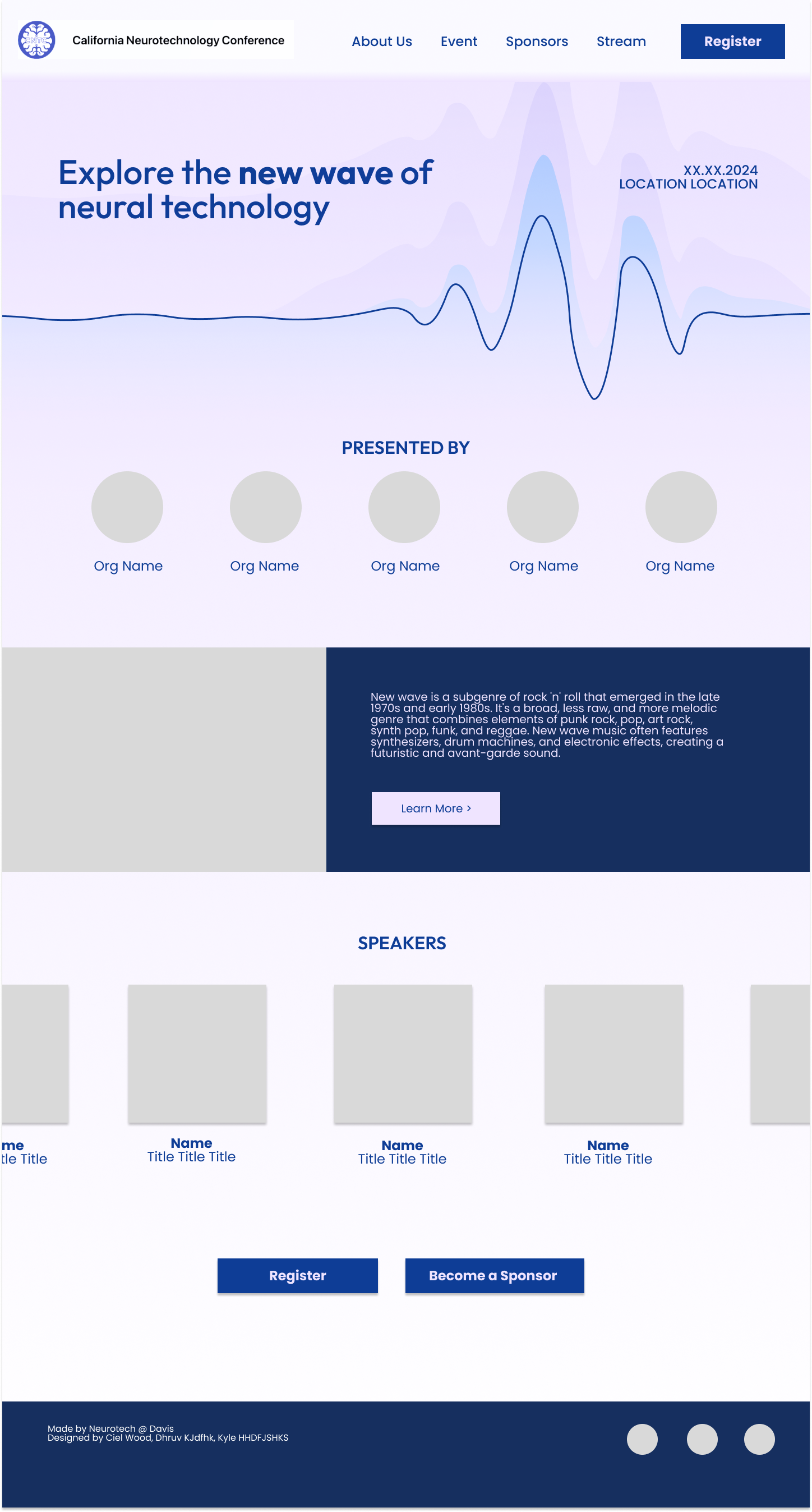
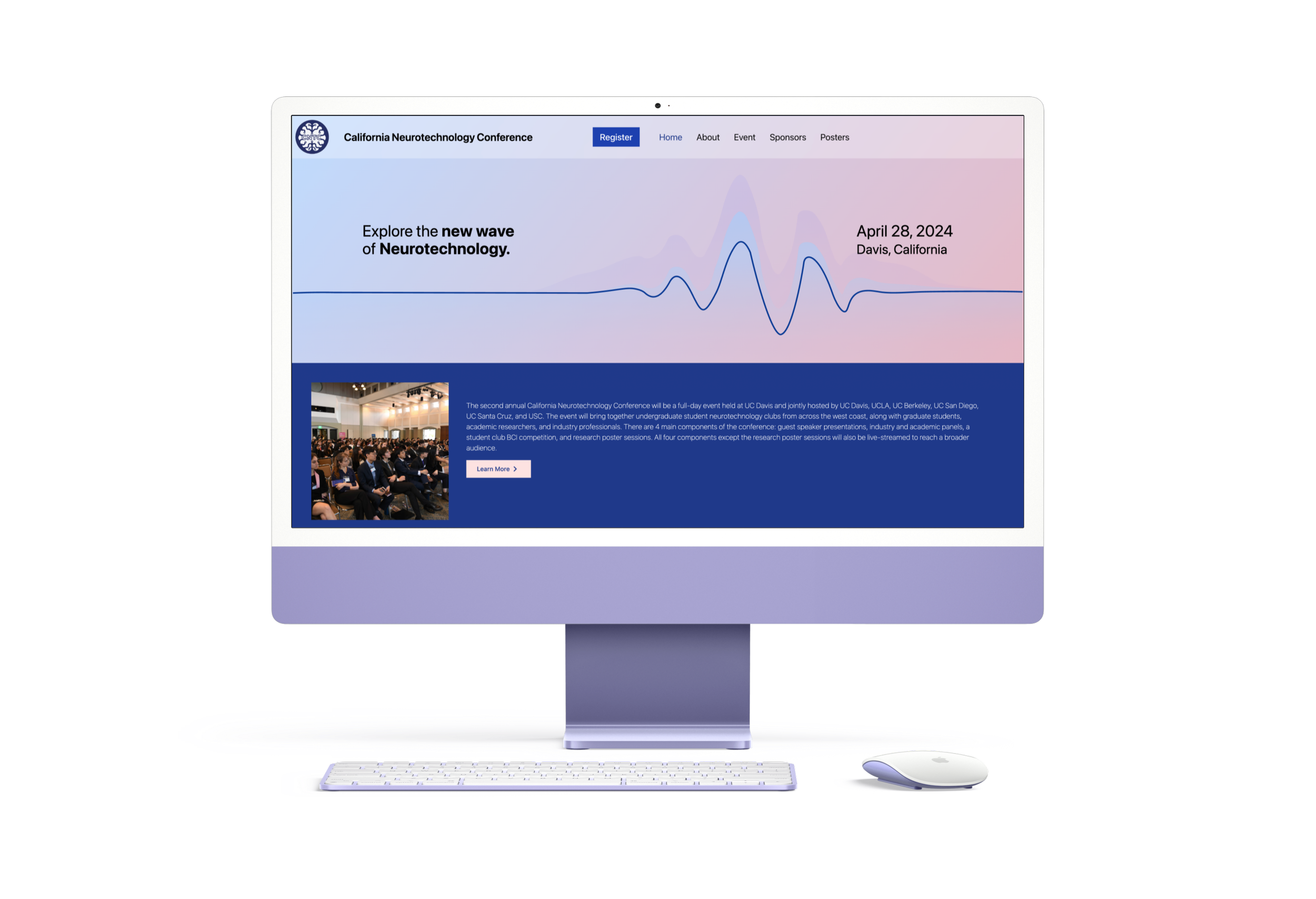
With the imagery and text given by the club, the final website was developed and published. There are a few things I would have changed about this version—such as increasing the side margins, or limiting the line lengths of text for readability. However, I was no longer involved after this step, and so could not make any more suggestions.
The final website
Reflection
While this project was a great opportunity to work with a developer to launch a real website, the disjointed communication between us really limited the quality of the final result. Using this experience as a starting point, I would make much more of an attempt to work with developers throughout the product design process in my next project, Wavelength, to ensure excellent implementation from beginning to end.