Prototyping
Resilience
Sparking engaging, accessible, community-led conversations about wildfire preparedness.
Overview
PROTOTYPING RESILIENCE is an NSF-funded project that uses gamification techniques to make uncomfortable conversations about wildfire preparedness not only comfortable, but engaging. I worked on the project for two years, doing everything from designing game mechanics to optimizing the game-making process to taking notes at in-person playtesting events. I was part of a larger, multidisciplinary team across the University of California, but for the most part, worked as a principal designer in a team with another designer, a game developer, and our supervisor. This particular project was done primarily by myself.
As my last task with the project, I opted to redesign the project’s website, which will be the main subject matter of this case study. For the most part, I focused more on user research, information architecture, and copywriting, and the user interface design was left primarily as-is.
DURATION
2 weeks
ROLE
UX Designer, Copywriter
TEAM
Solo, with feedback from fellow designers
The Spark
After NPR published a segment on our Tomales board game, Prototyping Resilience received an influx of interested communities, and traffic to the website spiked. However, the previous website hadn’t been updated in some time, and was outdated and not incredibly user friendly. So, I took upon myself the task of updating the website, so that we could partner with as many communities as possible, and help spread wildfire awareness as far as possible. So before conducting any user testing, I made a conscious effort to define our audience. From this exercise, I gathered the following takeaways about the kinds of people who might be our audience:
Come from a wide variety of backgrounds, including age, geographic location, and technical ability
May include community leaders or just concerned citizens
Some laymen may be completely new to the field of game making, and may also not know much about wildfire preparedness as a whole
May have a wide range of proficiency in English as a language
With this defined, I sat down with three users who aligned with this target audience, and conducted a guided user test of the existing website.
User Testing
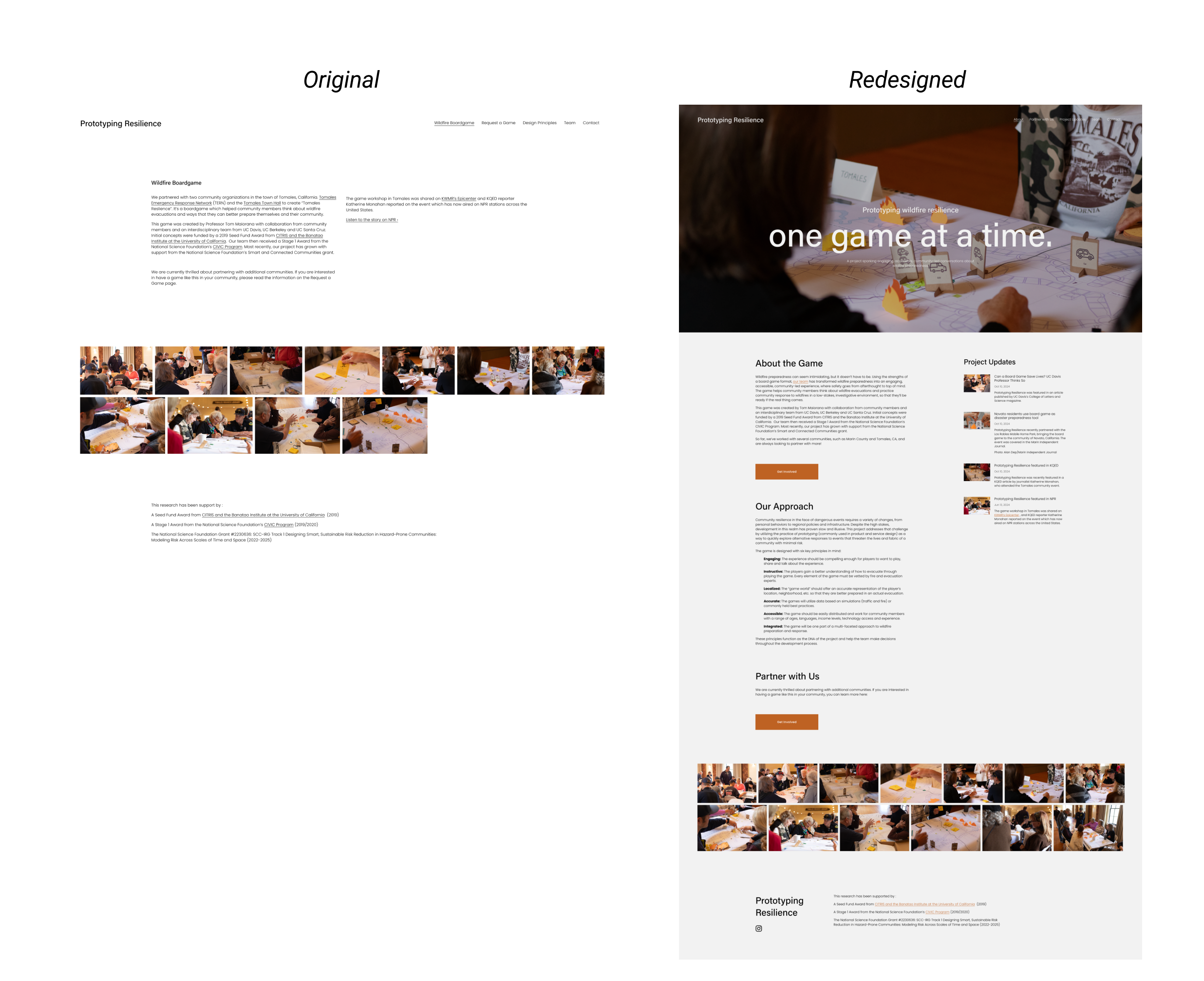
The website prior to redesign
Users were asked to explain what the website was for, navigate to its various pages, and to provide commentary as they did so. Through these user tests, I was able to confirm my suspicions: to a newcomer coming in with little preexisting knowledge of the project, the website hardly explained itself. My main three takeaways from the project were:
Nobody knew, from the name and description provided, exactly what Prototyping Resilience was. The photos hinted that it was a board game, but it was never explicitly explained.
Users found the copy on the website meandering, jargony, and not understandable to a common person. The academic language did not serve a general purpose audience.
The website was old and only discussed the board game that came out of a collaboration with organizations in Tomales, CA, rather than representing the project as a whole.
Using this information, I set out to define the basic needs of the redesign:
How might we redesign the website to be simpler, visually exciting, and easily updated?
Information Architecture
After brainstorming a variety of different layouts, I first came to settle on six primary pages, shown below. While the pages and their names stayed relatively similar to their original counterparts, the content and purpose of each page was more well-defined, and each included a more obvious call to action to encourage website visitors to get involved.
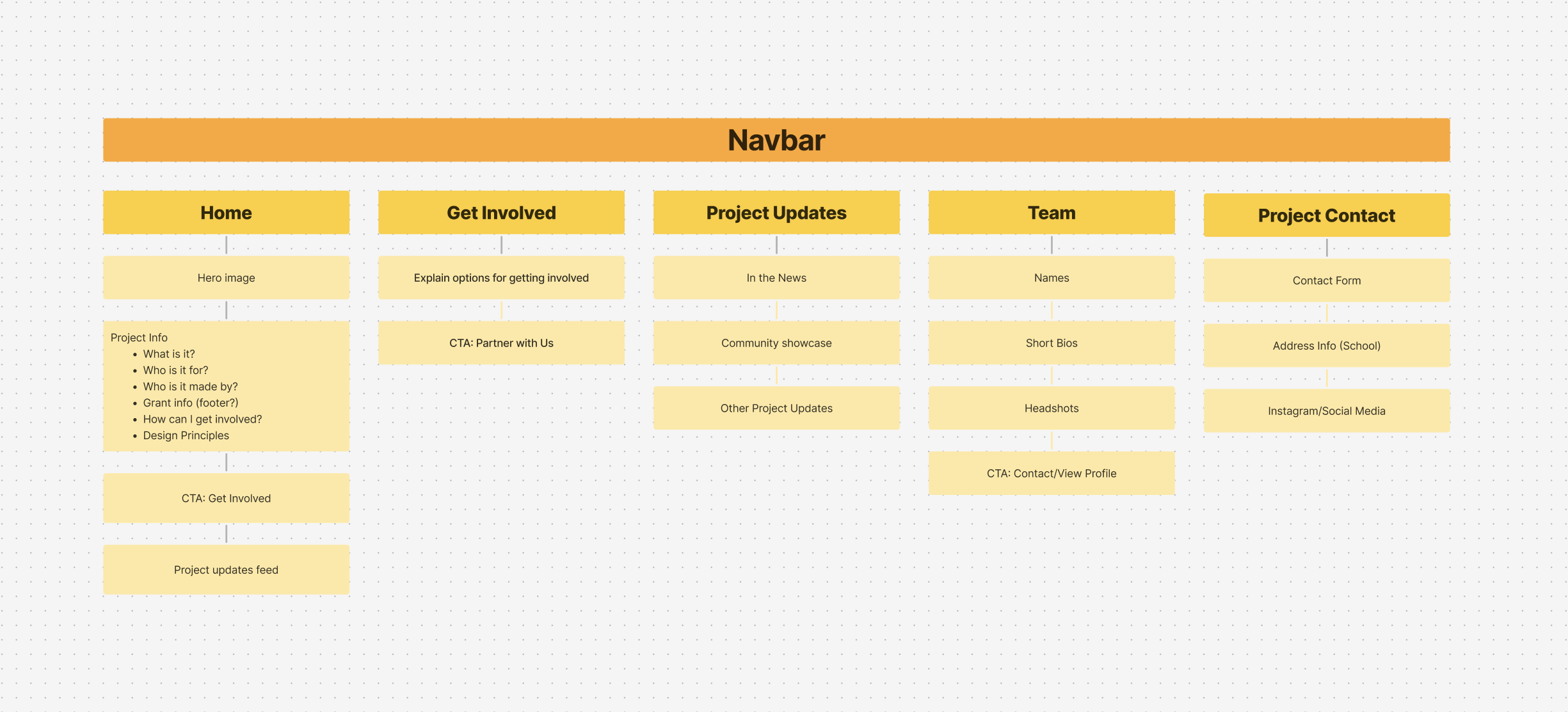
The most obvious change from the original website was the addition of a blog, which would allow for the easy publication of updates in a live feed, rather than relying on changing the copy of the pages themselves. This fulfilled the “Living” aspect of the redesign, and turned the website from static to constantly updatable.
The “Design Principles” page was also merged with the homepage, in order to further simplify the architecture of the website.
Wireframes
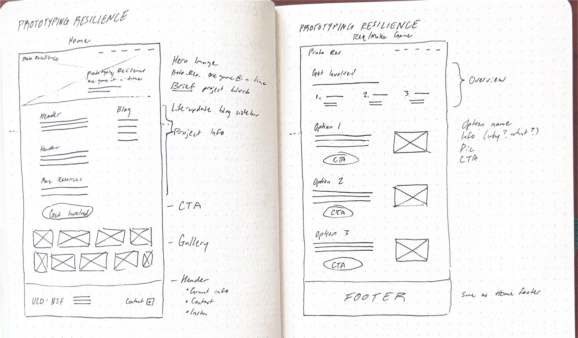
With the new information architecture settled, I sketched out new wireframes for the pages that would change the most: the homepage (also called About), and the Get Involved page. The blog would use one of Squarespace’s templates, so I did not focus there.
In the wireframes, I prioritized the visual aspect of the redesign, incorporating a hero image to make immediately obvious what the project is about, and further images to display the community events and options for partnership.
Copywriting
Aside from the layout of the website, my user testing showed the largest issue of the website to be more with the content than the organization itself. So, I set out to rewrite the website copy into something simpler, less formal, and altogether more exciting, to encourage website visitors to partner with us in practicing wildfire resilience.
With the new copy, I prioritized a friendly tone, simple language, and an eagerness to work together. I simplified the design principals from paragraphs to sentences, added attention-grabbing head copy, and explicitly explained the project in its entirety.
I also created guidelines for updating the blog, so that my predecessor would have no issues maintaining the website after I left.
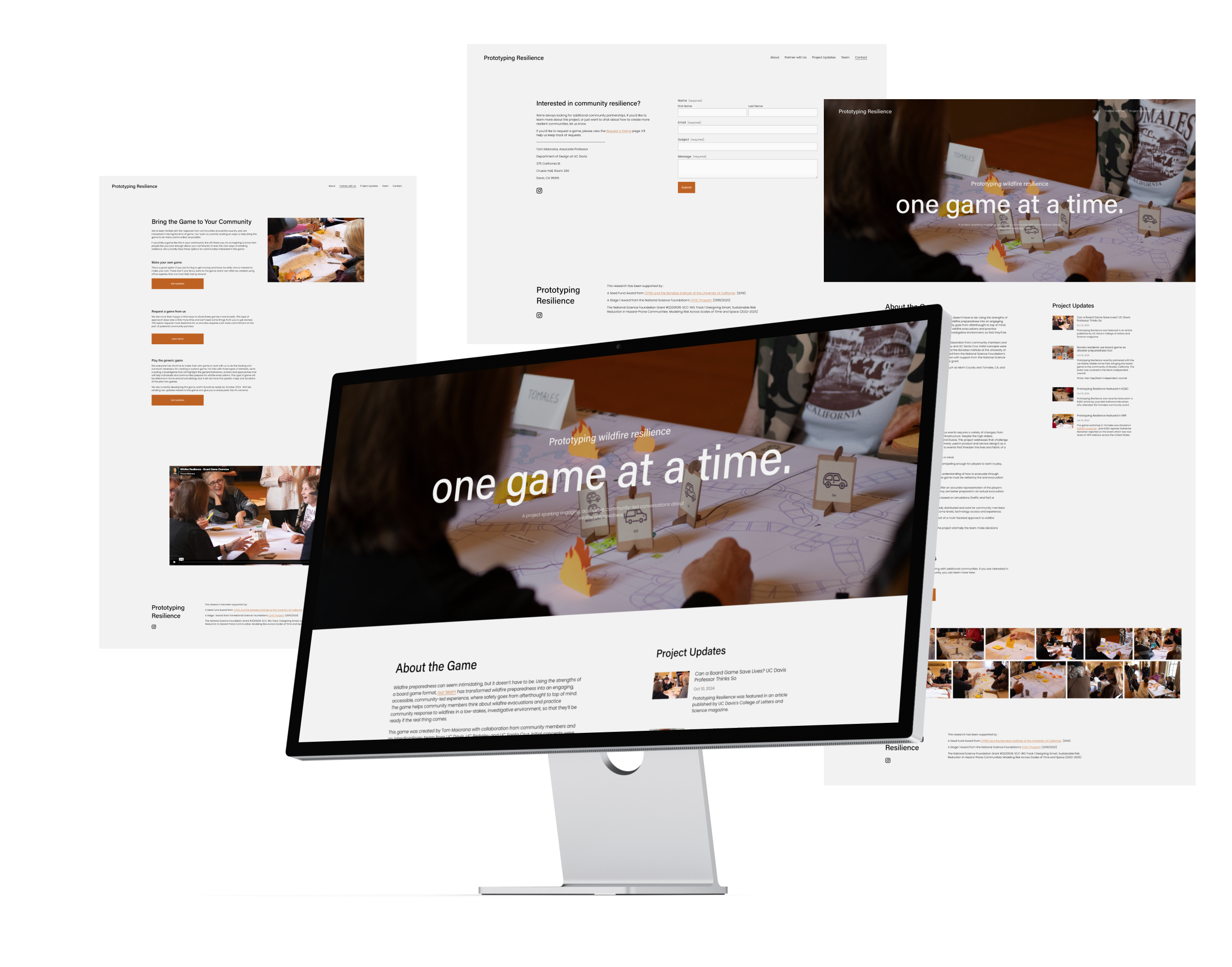
Putting It All Together
With some minor adjustments to the UI, which I was asked to leave mostly as-is (and found no research-based reason to change), I implemented the changes to both the content and architecture of the website, and, again, collected feedback from three new user testers. The response was a lot more positive this time and, with some minor tweaks to the copy, the entire website came together.